Ad blocker detected: Our website is made possible by displaying online advertisements to our visitors. Please consider supporting us by disabling your ad blocker on our website.
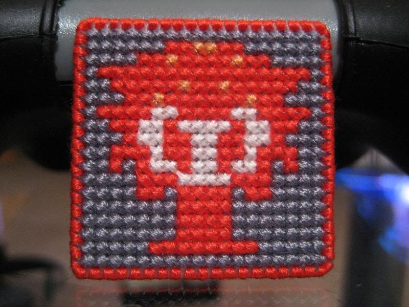
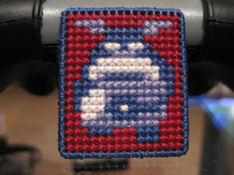
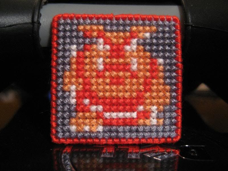
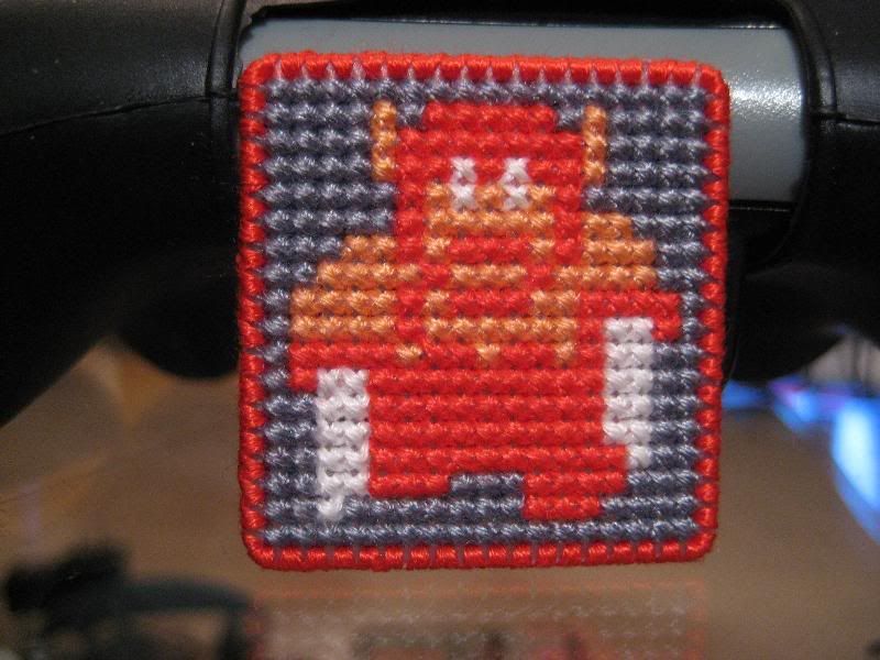
So I am working on some Legend of Zelda magnets (I am a one trick pony, I know it! ) but I am having some trouble with the colors. My idea was to stitch all the basic enemies, and alternate between the red and blue versions. I really like the way they look in red with the gray background, but for the blue versions I couldn't find a background that worked for me. I settled on a deep red and it looks OK, but it doesn't quite pop like the red.
I am thinking about just doing them all in the red version but I can't decide. Please let me know what you think. Thanks in advance!
Last edited by YeahYeahYouWere on Wed Nov 24, 2010 4:35 am, edited 2 times in total.
I see what you mean about the "pop" of the red one, and the lack of it in its blue counterpart. I think the issue here is not so much the background color, but the background color's saturation. If the foreground and background pigments are of the same intensity, then neither stands out. They eye can get overwhelmed by that. I'd suggest using a lighter tint of color for the backgrounds. Even a lighter grey might work.
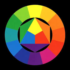
Stardrifter wrote:yellow is a contrast to blue, so that might give you the effect you're looking for? not sure. i know blue and yellow look pretty ok together, lol
Thank you for the input all, it's much appreciated! I actually considered the light orange that is the accent color on the Octorok for the background of the blue, but thought it might not 'flow' right having not shared a color back from the blue to the red (aka paralysis by analysis). I probably should have just gone with it. I REALLY like the way the grey background works with the red but it isn't right with the blue - the light blue blends with it too well and it just doesn't look right. I started with the same gray background and then cut it out after I was 1/2 done because it just wasn't right. I thought about a lighter grey too, but I am not sure that it wouldn't have the same problem.
I do not have any yellow shades handy, but perhaps orange would be good. Right now I am probably going to focus on the red series, but I'll get back to blue eventually...I think. I'll keep you all posted, and of course if more ideas are out there keep 'em coming!
Stardrifter wrote:yellow is a contrast to blue, so that might give you the effect you're looking for? not sure. i know blue and yellow look pretty ok together, lol
no, orange is contrast to blue.
ahh- forgive me for not knowing the color wheel. i was under the impression that not only the color directly across from another but also the colors to each side of the contrast were also contrasting colors. my bad.
In your defense, Stardrifter, there IS a shade of yellow across from blue on that wheel
I think either would look fine, but yellow would probably look best.


